In a roguelike deckbuilder the player spends most of the game looking at the same screen: a hand of cards at the bottom, a few enemies at the top and a handful of numbers in between. That screen has to answer three questions at a glance: what can I play, what will it do, and what is about to hit me. This guide walks through each part of a deckbuilder battle screen and the map, shop and reward screens around it.
The card: one layout, read in a second
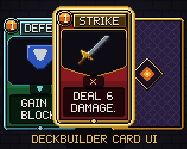
Every card in your game should use the same layout, so the eye knows where to look before it reads. Most deckbuilders settle on five boxes:
- A cost gem in the top-left corner, the first thing the player checks.
- A title plate along the top.
- An art window that shows what the card does at a glance.
- A small type plate under the art (attack, skill, power, curse).
- A text box at the bottom for the rules, short enough for two or three lines.
Keep these boxes as data, not as hand-placed numbers in every scene. A layout file with the rectangle of each box lets your card renderer place the title, cost and text the same way for every card, at any scale. At small pixel sizes, keep the rules text to a few words per line and move long explanations to a tooltip.
Types and rarities: two signals, two channels
Players need to tell a card's type and rarity apart in a crowded hand. Give each its own visual channel so they never fight. A good split is colour and shape for the type (a red attack with a pointed art window, a green skill with a square window, a blue power with an oval window, a purple curse with a jagged window) and the trim for the rarity: the border, the title plate and a small gem in grey, teal, gold, violet or orange. Shape matters as much as colour, because some players do not see red and green well.
Upgraded cards need one clear mark that survives a quick look: a different title plate colour and a small plus badge in a corner is enough.
Card states and motion
A card in the hand is in one of a few states: playable, selected, targeting or unplayable. Use a glow around the card for the first three and a dark overlay for the last, so the player never tries to play a card that cannot be played. Three short animations do most of the remaining work: drawing (a card flipping from its back), playing (a flash and a shrink toward the target) and exhausting (the card burning away). Six frames each are plenty at pixel art sizes.
Energy: the number that gates every turn
Energy is the resource the player checks before every play, so it deserves a large, clear orb near the hand, with the current and maximum value next to it (3/3). Show a partly spent orb as a lower fill, and let a full orb move a little, so the player can see at a glance that they still have energy left.
Enemy intents: tell the player what is coming
Intents are what make a deckbuilder fair: each enemy shows what it plans to do next turn. Use a small set of icons the player learns once:
- Attack, heavy attack and multi-hit, each with a number beside it (12, or 4 x3).
- Block, for an enemy that will defend.
- Buff and debuff, as arrows up and down.
- Unknown, for a surprise, and sleep, for an enemy that skips its turn.
Put the intent above the enemy and the number on a small plate beside it, so it reads at the same height for every enemy on screen.
HP, block and status effects
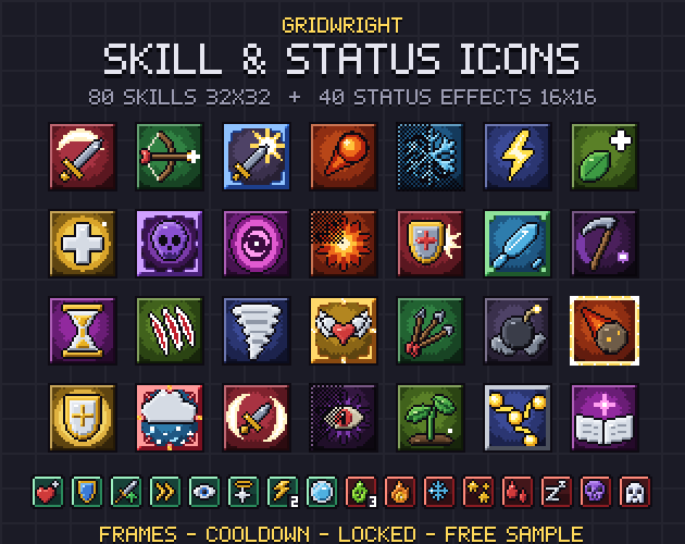
Each fighter needs an HP bar with the numbers written on it, a way to show block (a shield badge with a number, and a tint on the bar) and a row of status icons underneath. Status icons work best at 16x16 with a stack count in their lower-right corner: strength, weakness, vulnerability, poison, burn and the rest. If icon design is new to you, read pixel art icons for games, and for bars that stretch to any length, what 9-slice scaling is.
Piles and the end turn button
The draw pile sits bottom-left, the discard and exhaust piles bottom-right, each with a counter badge, and the end turn button above the right-hand piles where the thumb or mouse already rests. Make the end turn button the brightest thing on the screen when the player has no energy left.
Map, shop and rewards
Between fights the run is a map of nodes: fights, elites, rest sites, shops, treasure, unknown events and a boss at the top. Each node needs its own silhouette, a grey version for nodes already passed, a ring for where the player stands, and dotted paths between them. The shop shows cards and relics with price tags and a sold stamp; the reward screen lists gold, a card choice and a relic as rows the player clicks one by one. Relics live in a row of round slots along the top of the battle screen, so the player always sees what they own.
A ready-made kit
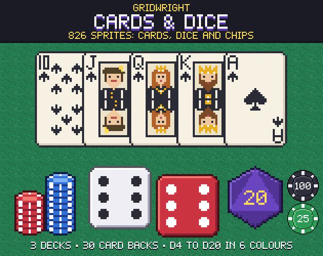
Our Gridwright Deckbuilder Card UI has these pieces as pixel art on a 16x16 grid: 40 card frames in 4 types and 5 rarities with upgraded versions and a card back, glows and draw, play and exhaust animations, an energy orb, 8 enemy intents, 16 status icons, HP bars with block, piles with counters, an end turn button, 40 relics, map nodes and paths, and shop and reward pieces, with the card boxes in a layout file. For poker, solitaire or casino games, see Gridwright Cards & Dice; for more buff and debuff icons, Skill & Status Icons.
All of our packs can be used in commercial games; you only cannot resell the files themselves, and packs released from October 28, 2026 on, this one included, ask for a credit: "Art by Gridwright" with a link. The details are in can I use game assets in a commercial game.