A horror game lives or dies on its map. Monsters and jump scares matter, but the player spends most of the game walking through rooms, reading them and deciding where not to go. In a top-down pixel art game you have very few pixels to do that with, so every tile has to pull its weight. This guide walks through building a horror map that reads well at 16x16: planning the rooms, choosing wall and floor finishes, placing the details that tell the story, and handling light and darkness.
Start with a floor plan, not with tiles
Before you open a tileset, sketch the building as boxes and corridors. Horror maps work best when the layout itself creates tension: a long corridor the player has to walk down, a locked door they can see but not open, a room they pass several times before they are allowed in. Write down for each room what it is for and what the player should feel there.
- A safe room: lit, clean, a place to save or read notes.
- A transition space: a corridor or stairwell that is dim and empty, where sound does the work.
- A wrong room: a familiar place where something is out of order (a toppled chair, a bed with restraints, writing on the wall).
- A destination: the morgue, the basement or the chapel, where the story pays off.
An abandoned hospital or asylum is a good first horror setting because players already know how such a building is laid out: wards off a central corridor, an office near the entrance, surgery and the morgue further in. You can then break those expectations on purpose.
Use wall finishes to tell the player where they are
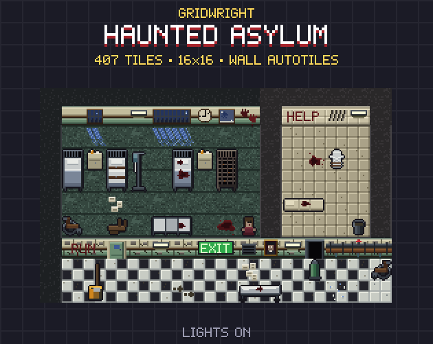
In a top-down three-quarter view the wall face is the most visible part of every room, so the wall finish carries a lot of meaning. Give each kind of room its own finish and keep it consistent: the player learns the code without being told. In Gridwright Haunted Asylum the walls come in five finishes that share one 47-tile autotile shape: ward paint, decayed ward paint, padded cell, glazed white tiles and basement brick. Because the shapes are identical, two rooms with different finishes still join cleanly where their walls meet.
A simple rule that works: clean finishes near the entrance, decay deeper in. The player walks from cream and green ward paint into peeling plaster and damp, then into bare brick in the basement. Nobody has to explain that things are getting worse. If you have not worked with blob autotiles before, our guide to choosing and using pixel art tilesets covers how the 47 pieces fit together.
Floors carry the history of a room
Floors are the background the player looks at the whole time, so keep them calm and let overlays add the story. Lay the base floor first (checker tiles in a corridor, linoleum in a ward, concrete in the morgue), mix its variants so the grid does not show, then put overlays on top: a stain by a bed, papers scattered near the office, plaster that has fallen from the ceiling, muddy footprints leading somewhere you do not want to go.
- Keep stains and debris as separate overlays, so you can control how grim each room is and reuse the same floor in a clean version.
- Lead the eye: a line of footprints or papers is a path the player will follow.
- Leave breathing space. A floor covered in details reads as noise, and then nothing feels wrong.
Props: one wrong thing per room
Horror is about the gap between what a room should look like and what it does look like. Furnish each room so it reads as normal first, then change one thing. A ward with six neat beds and one bed stripped to its rusty springs. An office where every filing cabinet is closed except one. A morgue with one drawer pulled out. A chapel with the candles still burning when nobody should be there.
Animated props are worth their frames here. A surgical lamp that flickers, a portrait whose eyes move between frames, a door that opens on its own: small loops of two to four frames are cheap to add and make the player stop and look. Keep them rare so they stay unsettling.
Writing on the wall
Short words painted or scratched on a wall do more than a page of text. HELP, GET OUT, tally marks in a padded cell, a spiral repeated over and over: the player fills in the story. Keep wall writings short enough to read in one glance at your game's zoom, place them where the player stops (beside a door, at the end of a corridor), and do not overuse them. One message per area keeps each one a moment.
Light first, darkness second
Darkness only works when there is light to compare it with. Decide where the light comes from in every room before you darken anything: a barred window with moonlight falling on the floor, a fluorescent tube, an exit sign, candles in the chapel. Those sources are where the player will look and where you can put the things you want them to see.
Flicker is the cheapest horror effect in pixel art. A tube light with four frames (on, dim, off, buzzing) played in an uneven order, such as 1 1 1 2 1 3 1, looks like a failing light instead of an animation. Use it on one or two lights per area, not all of them.
Three ways to make it dark
There are three common ways to darken a 2D map, and they combine well.
- A night palette: swap the tiles for darker versions in which the lights stay lit. The Haunted Asylum ships a lights-out copy of every piece with the same file names, so you can switch a room when the power goes out.
- Dither overlays: tiles that cover a cell with a pattern of black pixels (25, 50, 75 or 100 percent). They keep the hard pixel look that smooth gradients lose, and they line up with each other on a 4 px grid.
- A flashlight: a darkness overlay with a round hole in the middle that follows the player. If its edge is solid black, it joins full-darkness tiles around it without a seam.
If your engine has 2D lights, you can use them instead of overlays or on top of them. Many developers still use dither tiles for the darkest areas, because a dither keeps the art crisp at whole-number scales while a soft light blurs it.
Sound and pacing finish the job
A map sets the stage, but timing makes the scare. Put the empty, quiet stretches before the busy rooms, let the player hear something before they see it, and give them a lit safe room after every frightening one. Our Weather FX rain and fog loops on the windows and outside areas add atmosphere without asking for attention.
A quick checklist
- Every room has a purpose and a feeling written down.
- Wall finishes change as the player goes deeper.
- Each room has one wrong thing.
- Light sources are placed before darkness.
- Flicker and animation are rare.
- The player always knows the way back to safety.
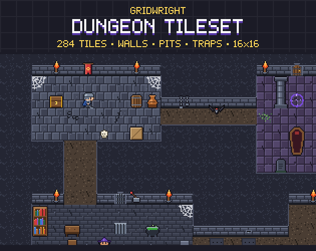
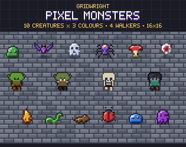
Need enemies to fill the halls? Our Pixel Monsters are on the same 16x16 grid, the Dungeon Tileset covers the stone corridors below the building, and the Dark Fantasy UI gives the menus the same mood.
Gridwright packs can be used in commercial games; you may not resell the files themselves. Packs released from October 28, 2026 ask for a credit: “Art by Gridwright” with a link (each pack’s LICENSE.txt says which applies). More in can I use game assets in a commercial game.