A simulator or tycoon game on Roblox lives on its icons. Players read the HUD at a glance: coins, gems, the egg shop, the rebirth button, the timer of a 2x boost. Then there are the game pass and developer product images, the small pictures that sit on the store page and decide whether someone taps Buy. This guide covers the practical side: how big each image should be, what the round crop does to a pass icon, which sizes work for buttons, and how to keep a whole set consistent without uploading two hundred files one by one.
The game pass image: 512 pixels and a circle
Roblox's own page on passes gives three rules for the pass image. It should not be larger than 512 x 512 pixels. It has to be a .jpg, .png or .bmp file. And it should not have important details outside its circular boundary, because the image is shown inside a circle. If you skip the image, Roblox shows a default icon instead, which looks unfinished next to other games' passes.
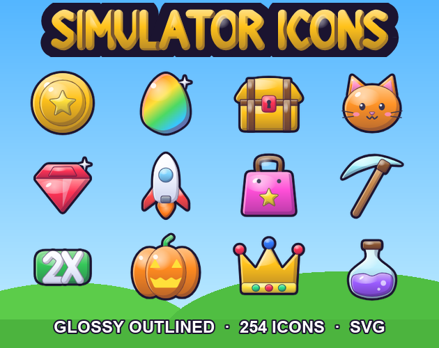
The circle is the rule people miss. A square picture with a label in the corner loses the label. The safe way is to design the icon round from the start: put the object in the middle, keep a label close to the centre line, and treat the four corners as empty. In our Simulator Icons for Roblox the 24 gamepass icons keep everything inside a circle of radius 230 on the 512 canvas, so the crop never touches the art.
What to put on a pass icon
A pass icon has to say what the pass does in less than a second. The ones that read best follow the same recipe:
- One object that names the perk: a clover for luck, a magnet for auto collect, a winged boot for speed, a crown for VIP.
- A short label in big letters: 2X, VIP, AUTO, +3. Long words shrink to nothing on a phone.
- One background colour per kind of perk, so a player learns that green means money and purple means hatching.
- A thick dark outline round the object and the label, so the icon still reads on a dark or a light store page.
- No tiny details. The store shows these images small; a 512 pixel drawing with fine lines turns to mush.
Keep the whole set in one style. A store with a glossy VIP icon, a flat 2x Cash icon and a photo-like Auto Hatch icon looks like three different games.
Icon sizes for buttons and the HUD
Inside the game you are not limited to one size, and the right size depends on where the icon sits. A rough guide that works for most simulator layouts:
- 512 px for shop art, big popups and the pass images themselves.
- 256 px for menu buttons and cards (the shop, pets and inventory buttons on the side of the screen).
- 128 px for the hotbar, currency counters and boost timers.
- 64 px for small markers, list rows and spritesheets of many icons.
Upload a size at least as big as the icon will appear on a large screen. A 64 pixel file stretched across a 200 pixel button on a tablet looks blurry. Going the other way is fine: a 256 pixel icon shown at 100 pixels stays sharp. If your icons come with SVG sources you can also make any size you need, which helps when a design calls for an odd button size.
Spritesheets: one upload for many icons
Uploading every icon as its own image is slow and leaves you with a long list of asset ids to manage. A spritesheet puts many icons on one image. An ImageLabel or ImageButton then shows just one cell of that image using two properties, ImageRectOffset (where the cell starts) and ImageRectSize (how big the cell is). Both are Vector2 values.
The workflow is simple. Upload the sheet once and set the label's Image to its id. Then, for each icon, set ImageRectOffset to the cell's top-left corner and ImageRectSize to the cell size, for example 128 by 128. Our icon pack ships 1024 x 1024 sheets with 64 icons at 128 pixels, and a single sheet with every icon at 64 pixels, plus a JSON file with the offset and size of each icon, so the numbers never have to be measured by hand.
Spritesheets suit icons that share a size: the hotbar, the inventory grid, the list of pets. Big one-off pictures, like a shop banner, are easier as single images.
Buttons that stretch without breaking
Icons usually sit on a back: a rounded square or a circle that acts as the button. If the back has to stretch to different widths, set the image's ScaleType to Slice and give it a SliceCenter. Roblox describes Slice as turning the image into a nine-slice UI: the corners keep their shape and only the middle stretches. Our post on 9-slice scaling explains the idea with pixel art panels; the same thinking applies to glossy Roblox buttons.
A clean way to build a button is two layers: the back in an ImageButton, and the icon in an ImageLabel inside it at about 70 percent of the back's size. Then a hover or press effect can scale the button without touching the icon file.
Outlined or not, glossy or stud
Two choices shape the look of a Roblox UI more than anything else. The first is the outline. A thick dark outline makes icons pop over busy game scenes and colourful skies; icons without one feel softer and suit clean menus. The second is the surface: smooth glossy shading with a shine, or the classic stud look with round toy-brick bumps on the big surfaces. Pick one combination for the whole game and stick to it.
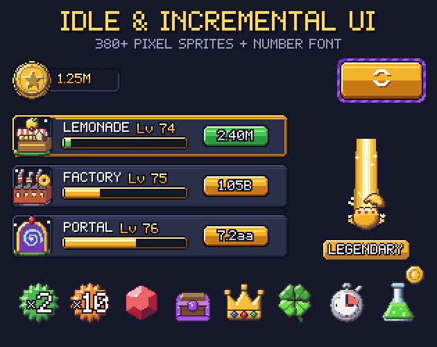
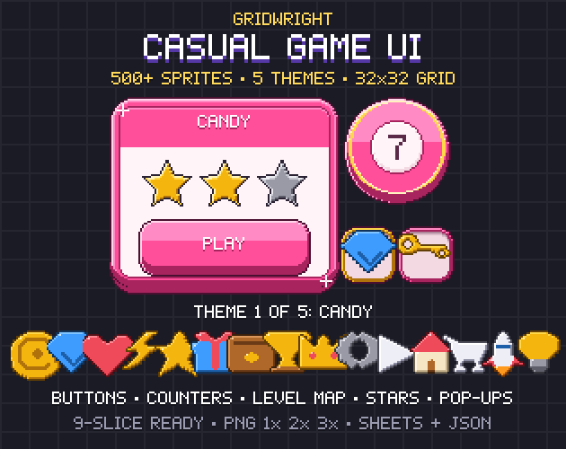
That is why our Roblox pack comes in four versions of every icon, Glossy and Stud, each outlined and not, at 512, 256, 128 and 64 pixels. If your game also has an idle or clicker side, the Idle & Incremental UI kit covers upgrade rows and big numbers in pixel art, and our guide to idle game UI walks through that layout. For chunky mobile-style buttons in pixel art, see the Casual Game UI.
A checklist before you upload
- Pass images: 512 x 512 or smaller, PNG, everything important inside the circle.
- One style for the whole set: same outline, same shading, same light direction.
- Each icon uploaded at least as large as it appears on a big screen.
- Spritesheets for sets of same-size icons, with the offsets written down (or taken from a JSON file).
- Stretching backs set to Slice with a SliceCenter.
- No logos, currency symbols or characters that belong to someone else.
You can use our icons in your own Roblox experiences and in games in any engine, commercial ones too, and credit is not required; you may not resell the files or upload them as a Creator Store asset. More on that in can I use game assets in a commercial game.