Cozy games ask players to slow down. Farming, decorating, cooking and chatting with neighbours all happen at the player's pace, and the interface has to match. A loud, glossy UI with flashing buttons fights that mood; a soft, quiet one supports it. This guide covers how to design a cozy game UI that stays calm while still showing everything a farming or life-sim player needs to know.
What makes a UI feel cozy
Cozy is not one colour palette. It is a set of choices that all lower the tension on screen.
- Soft colours: warm creams, muted greens, pastel accents. Save strong red for real warnings.
- Rounded or natural shapes: wood, paper, leaves and stitched edges read as handmade and friendly.
- Low contrast in the frame, higher contrast in the content: the panel should be quiet so the icons and text stand out.
- Few things moving at once: a gently bobbing arrow is enough; nothing should pulse for attention unless it matters.
- Small, consistent sizes: a strict grid keeps everything tidy, which reads as calm.
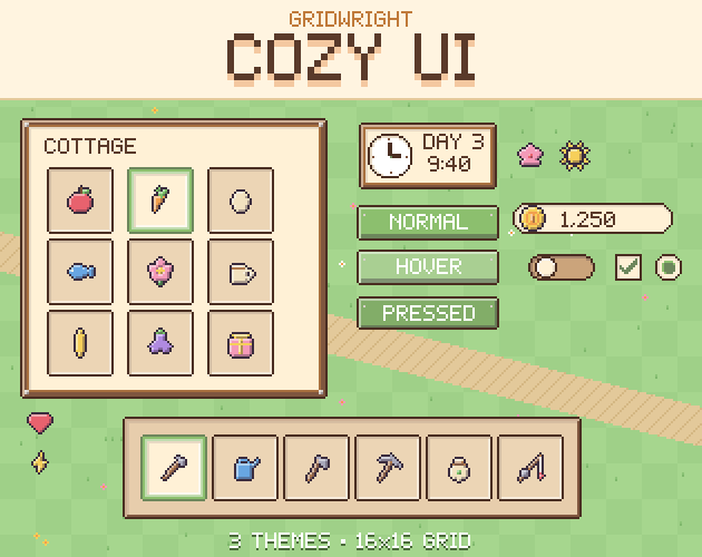
Pick one material for the frames and use it everywhere. A wooden cottage frame, a paper sheet with washi tape or a leafy garden border each tells the player what kind of world they are in before they read a word. Gridwright Cozy UI ships those three looks with the same pieces in each, so you can try them in your game and keep the one that fits.
The farming HUD: what to show and where
A farming HUD has more to track than most games: time, day, season, weather, money, energy and the tool in hand. The trick is to keep each piece in a fixed corner so the player's eye learns where to look and then forgets the HUD is there.
- Top right: a clock with the day and time, with small season and weather icons next to it. Time is the main pressure in a farming game, so it gets the most visible spot.
- Top left: money and other currencies in small pills, each with its icon on the left.
- Under the money: energy and health bars, short and thin. Use a warm yellow for energy and a soft pink or red for health.
- Bottom centre: the hotbar with the tools and seeds, the selected slot clearly marked.
- Right side, only when needed: the day's tasks as a short checklist.
Leave the middle of the screen empty. The player is looking at their farm, not the HUD.
Hotbars and inventory slots
The hotbar is the part of the UI the player touches most, so its states need to be obvious at a glance. Four states cover almost every game:
- Normal: the empty or filled slot.
- Hover: a lighter slot when the mouse is over it.
- Selected: a coloured ring around the active tool.
- Locked: a greyed slot with a small lock, for bag space the player has not unlocked yet.
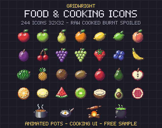
Keep slots square and on the same grid as the rest of the UI, and centre a 16x16 icon in a 32x32 slot so there is room for a stack count in the corner. Our pixel art icons guide has more on drawing icons that read at that size, and Food & Cooking Icons covers the harvest once it leaves the field.
Shops and quests in rows
Shops and quest logs are lists, and lists are easiest to read as rows: icon on the left, name next to it, price or reward on the right, one button at the end. Give every row the same height, line up the prices in one column and grey out what the player cannot afford instead of hiding it. That way the player sees what to save up for.
Rows and panels should stretch without distortion, which is what 9-slice scaling is for: the corners stay sharp while the edges and the middle repeat. If you have not set this up before, read what 9-slice scaling is. Every stretching piece in Cozy UI has its 9-slice margins in a JSON file.
Dialogue that feels like a conversation
Talking to neighbours is half of a life sim. A good dialogue box has four parts: the box itself across the bottom of the screen, a portrait frame on the left, a name plate above the text and a small arrow that says there is more. Keep two or three short lines per box, use a soft name plate colour per character if you like, and let the arrow bob slowly instead of blinking.
Friendship is often shown with a row of hearts per character. Full, half and empty hearts in the same size as your other icons keep that screen in the same style as the HUD.
Settings without breaking the mood
Even the settings screen can stay cozy. Use the same frame as the rest of the UI, sliders for music and sound, a toggle for fullscreen and checkboxes for small options. Put Save and Back buttons at the bottom in the same place every time. Buttons need four states (normal, hover, pressed, disabled) so the player always knows what will happen when they click.
Text and fonts
Pick one readable pixel font for everything and one display font for titles at most. Dark brown or dark green text on cream reads more softly than black on white. Our pixel fonts guide explains sizes and spacing, and Pixel Fonts 2 has rounded designs that suit a cozy game. Note that Cozy UI itself does not include fonts.
A cozy UI checklist
- One frame material and one soft palette across every screen.
- Everything on one grid; sizes are multiples of 16.
- HUD pieces fixed in the corners, the centre left empty.
- Hotbar slots with normal, hover, selected and locked states.
- Shops and quests as rows with icons, prices and one button each.
- Dialogue with a portrait, a name plate and a gentle next arrow.
- Buttons with four states and settings that use the same frames.
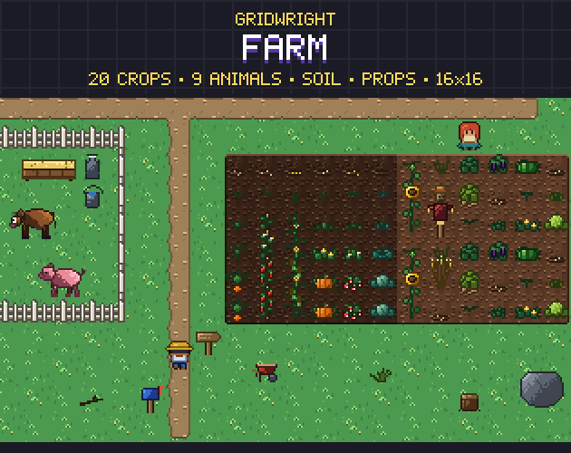
Pair the UI with a world in the same spirit, for example the crops and animals in Gridwright Farm, and add small activities like a fishing minigame for days when the crops are done. Gridwright assets can be used in commercial games; newer packs like Cozy UI ask for a credit with a link, and reselling the files is not allowed. Details are in can I use game assets in a commercial game.